Branding︎︎︎

回力 Warrior
Branding ︎︎︎
Branding ︎︎︎
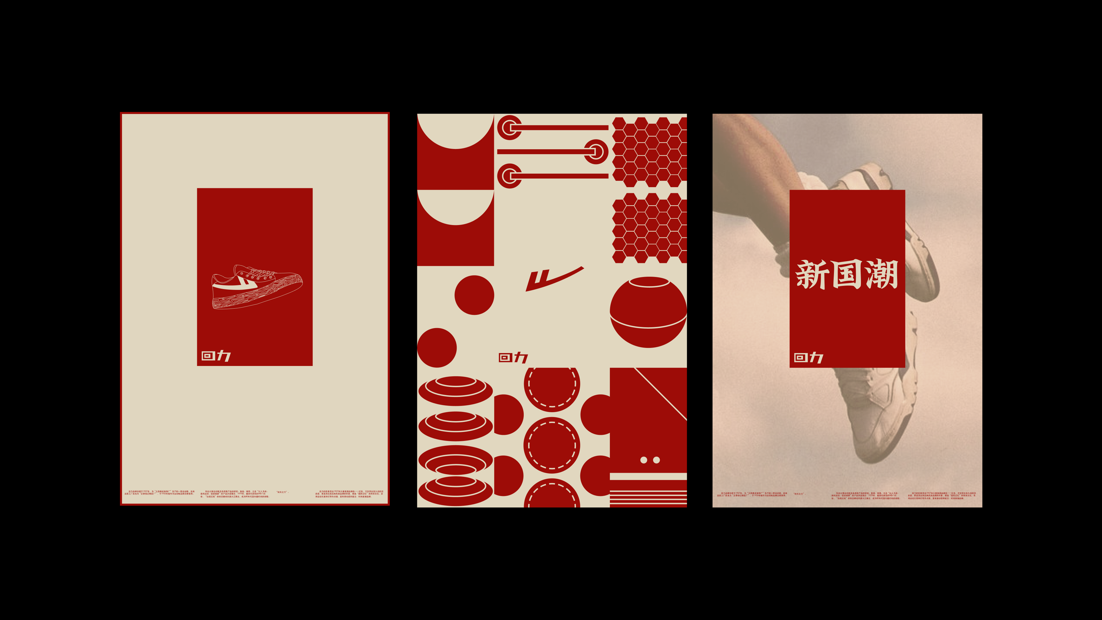
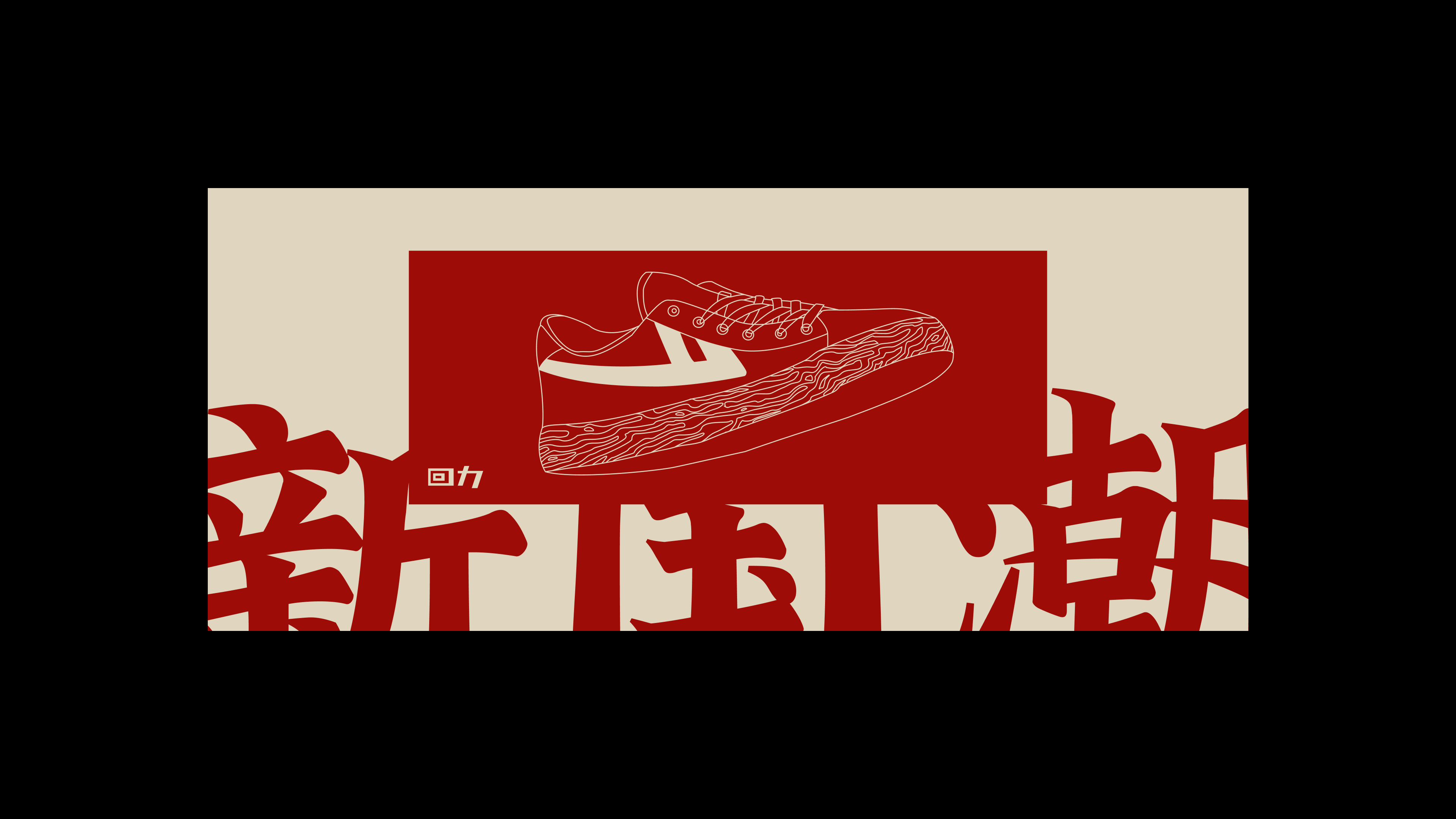
This project is designed for a sports brand, 回力, Warrior. By starting with adjusting the logo into more modern look, the bottom “serif” of the Character 力 is changed into a simple and slanted shape, to be a contrast with the rectangular shape character 回. The new logo can bring out a more modern and graphic look.
More ︎︎︎
More ︎︎︎
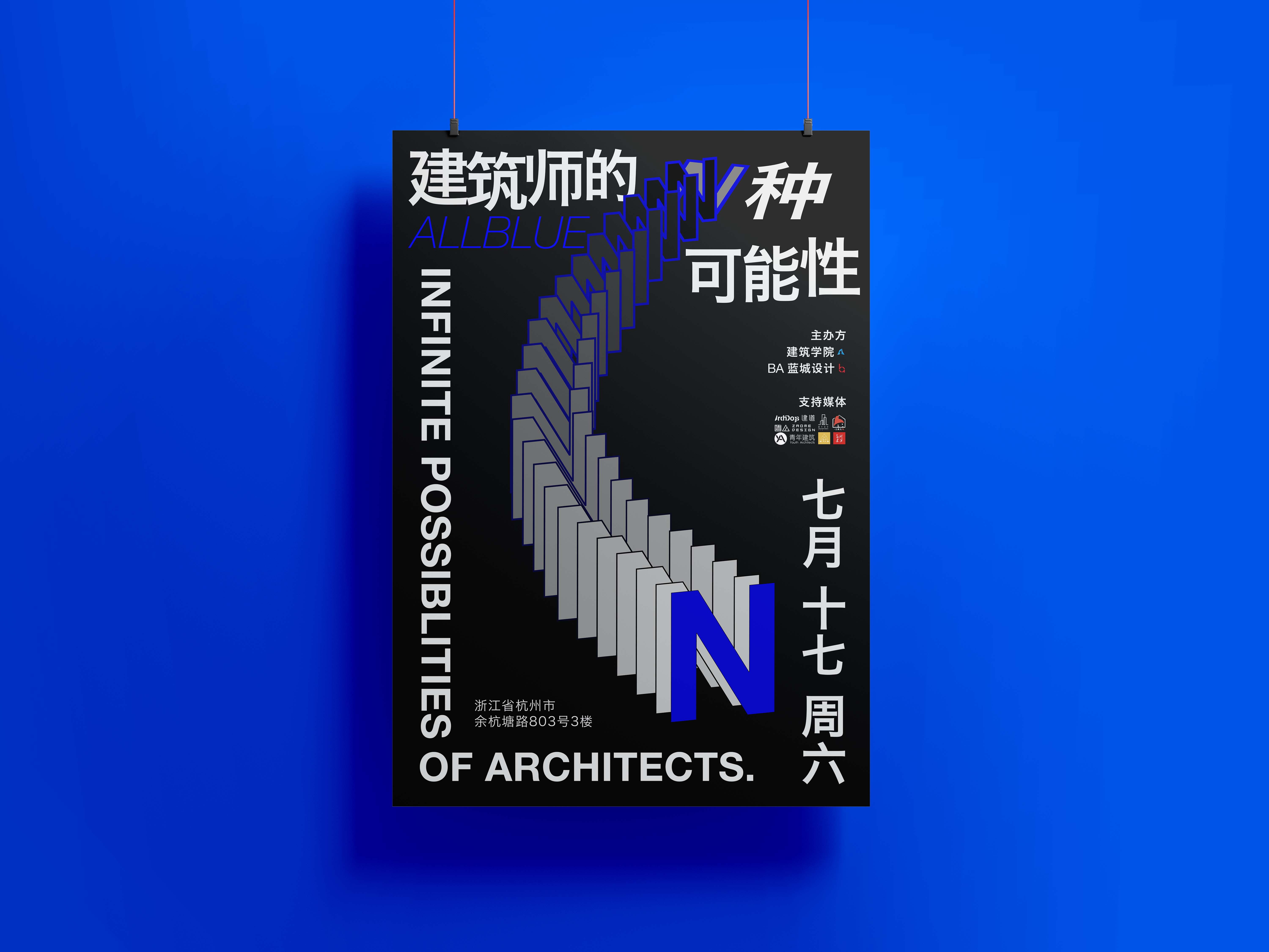
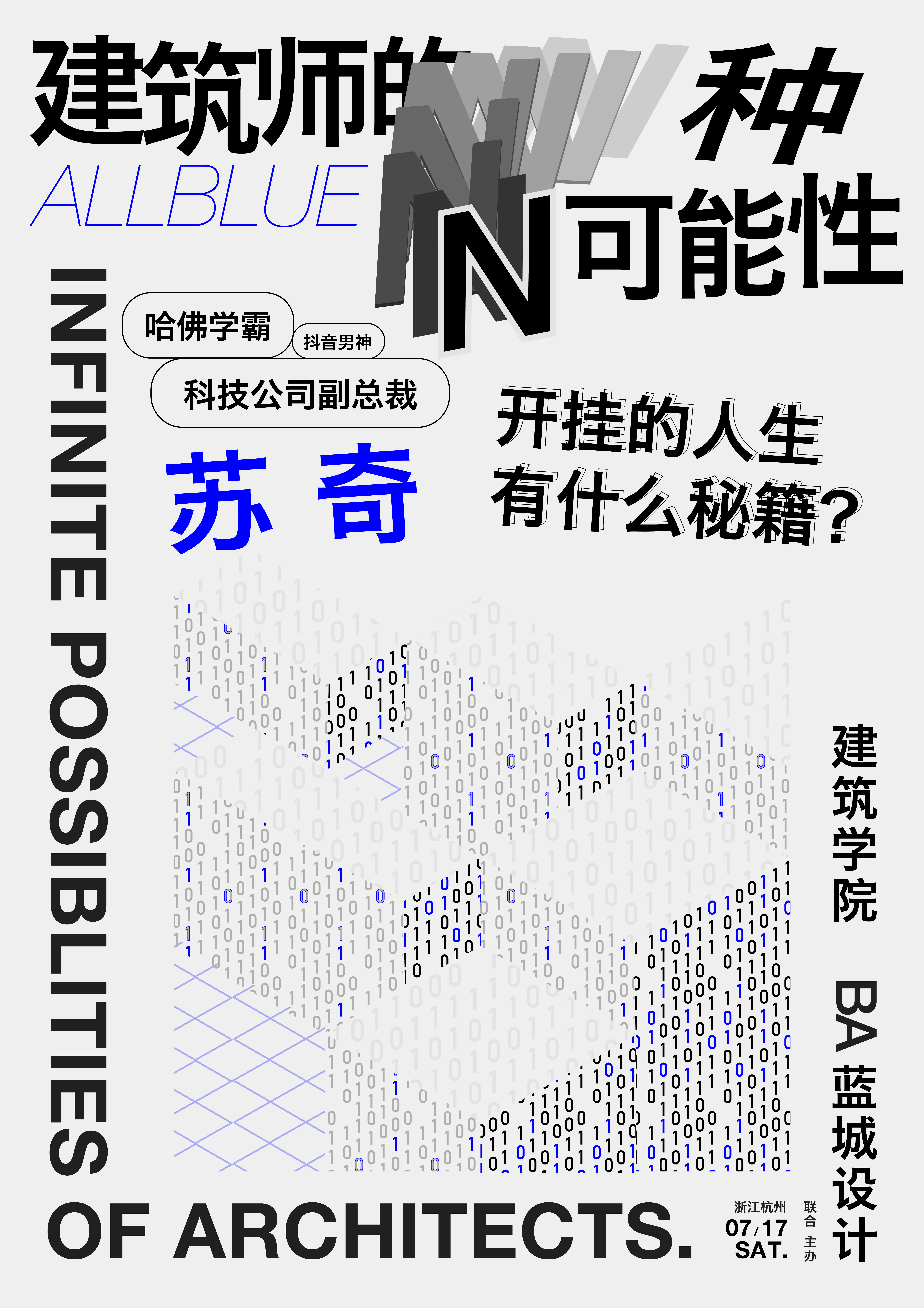


Infinite Possiblities of Architects
Branding ︎︎︎
Branding ︎︎︎
This project is designed for company, Bluetown Architects, for an architects’ gathering event. By exploring different career directions of architects, the main focus is to highlight the variety in the architects group, which develops the idea of playing with letter N because N means infinity in math. Bright blue is a representable color of this company, and by combining the graphic illustration elements to emphasize on the different topics of what architects are passionate about. Each light-color background poster is an introduction of the architect who gives a talk on that event. The target audience is mainly towards younger architects and college students, so the expression of visual elements is more vivid and playful.
Ideal Life
Branding ︎︎︎
Branding ︎︎︎
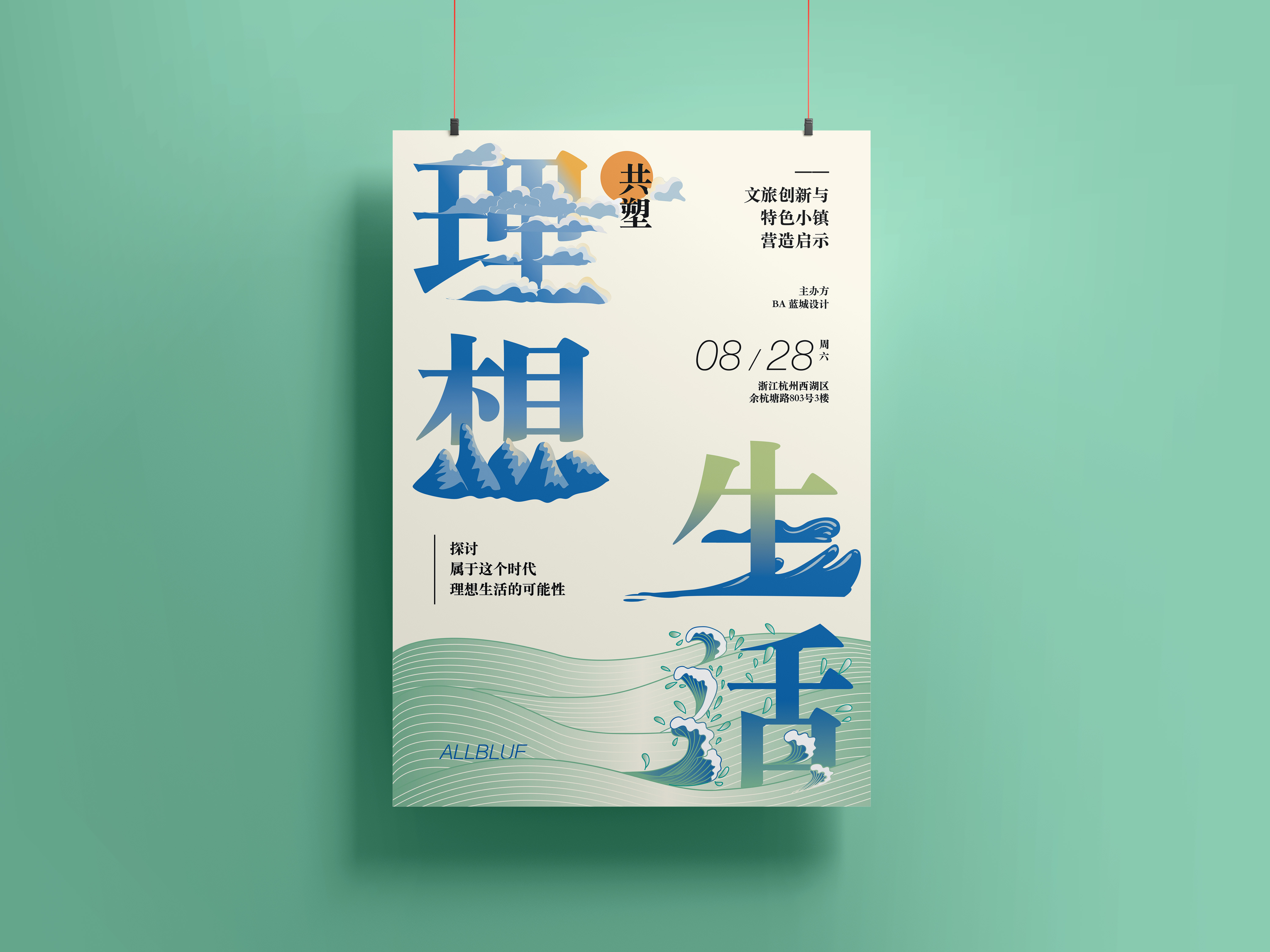
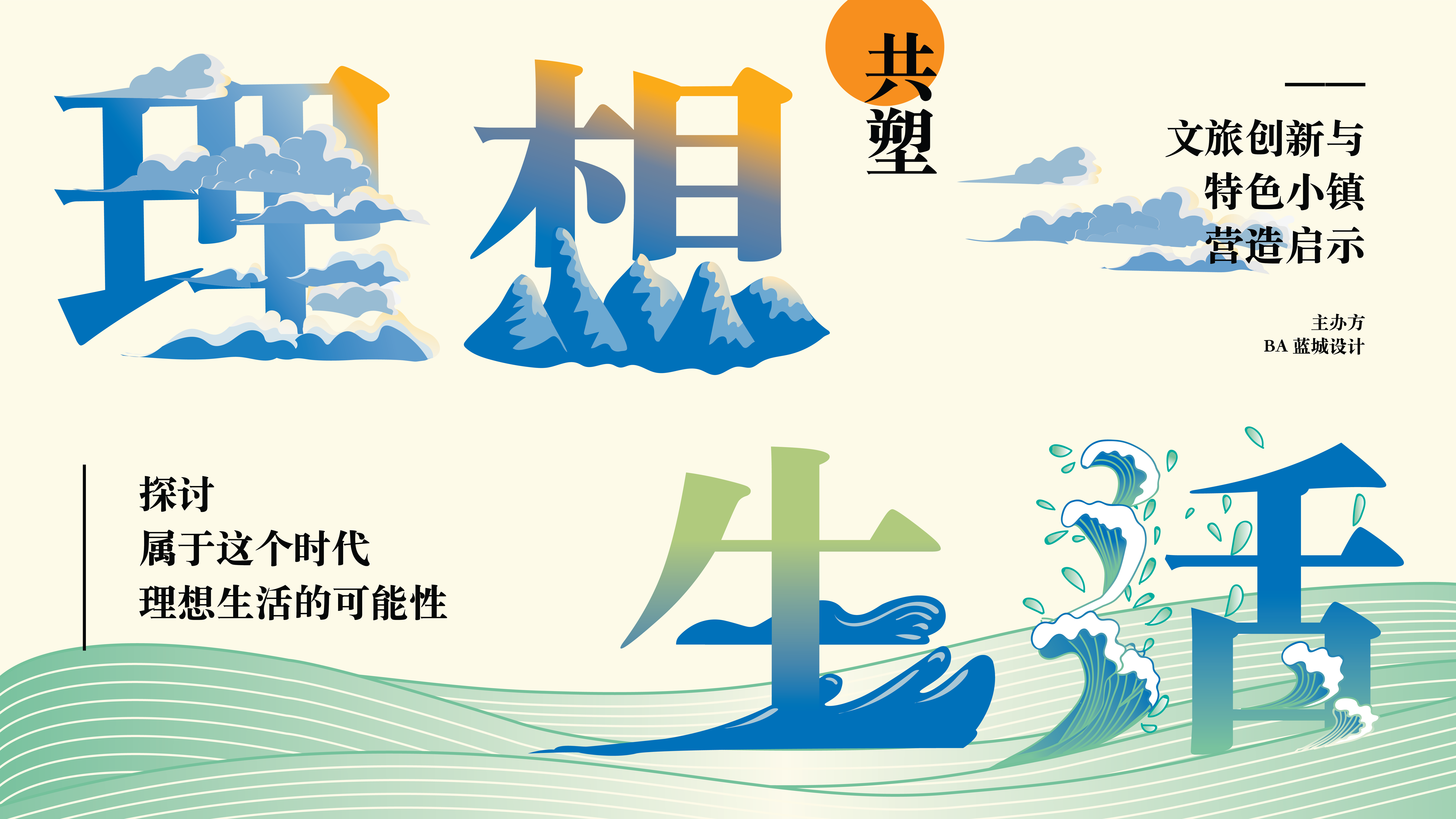
This project is also designed for company, Bluetown Architects. The company decided to host an openning for their newly done project by combining talk forum with visiting the real place. The project mainly focuses on the landscape and how its natural form brings comfort for users. Branding ideas also extend this idea of comfort from nature. By using green and blue to visualize natural elements including mountains, streams, sky, clouds, sea waves, etc... The graphic illustrations are combined its orginal Chinese characters’ structure to transform into a pictoral symbol of how ideal life could look like and feel like. The target audience is mainly towards people who look forward to live by nature.
