A Product Designer with Visual Design background;
Previously worked at design agencies in New York: Area 17, Once-Future and Hudson Wilder
Selected work, 2D, 3D
Koara
2021
Typeface
Instructor:
Fred Shallcrass
Keywords: typeface, children, reading
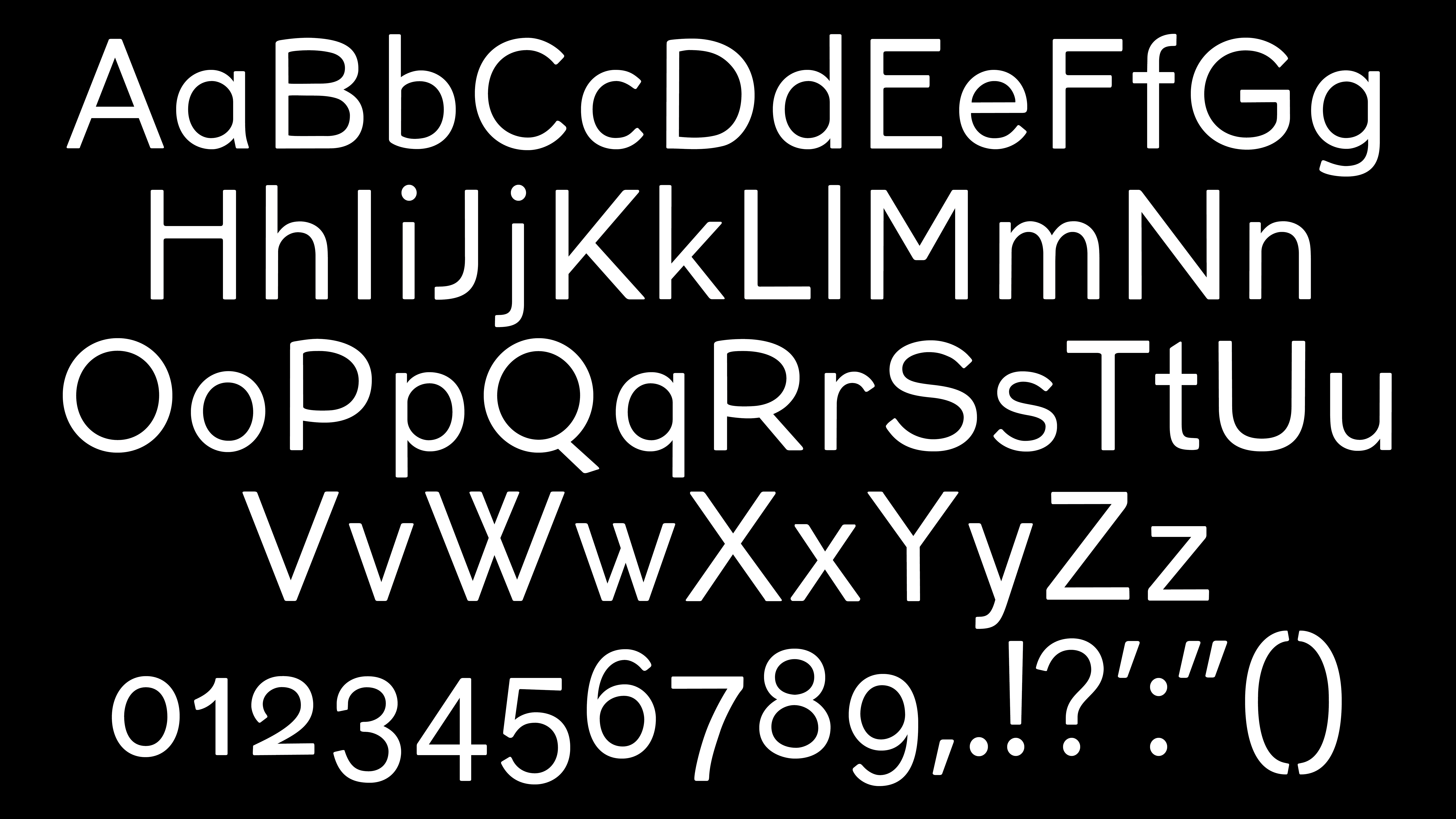
Koara is crafted specifically for children's book text, inspired by the need for more characteristic in the typography of my brother's kindergarten books. While their illustrations were engaging, the typeface lacked distinctiveness.
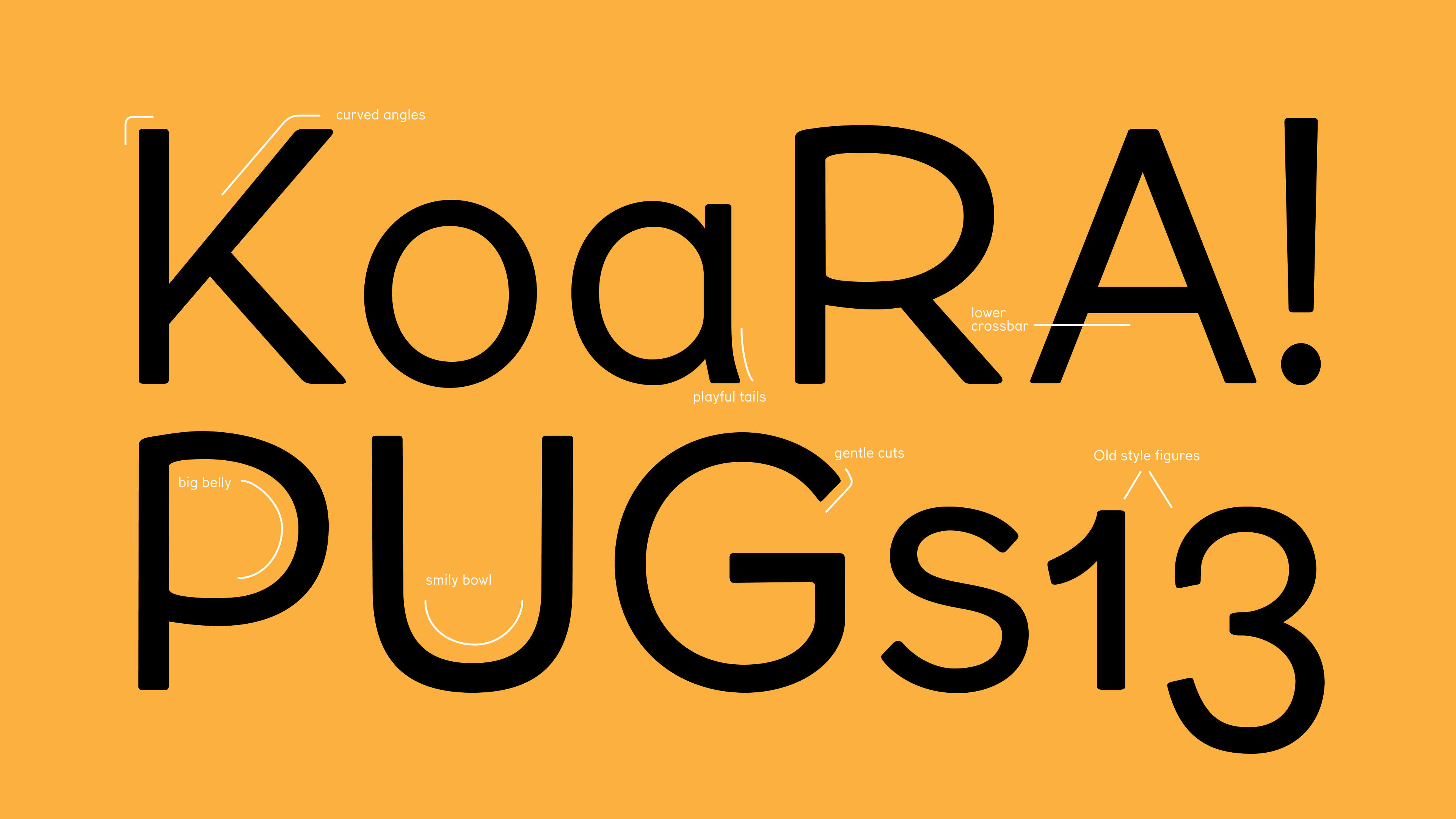
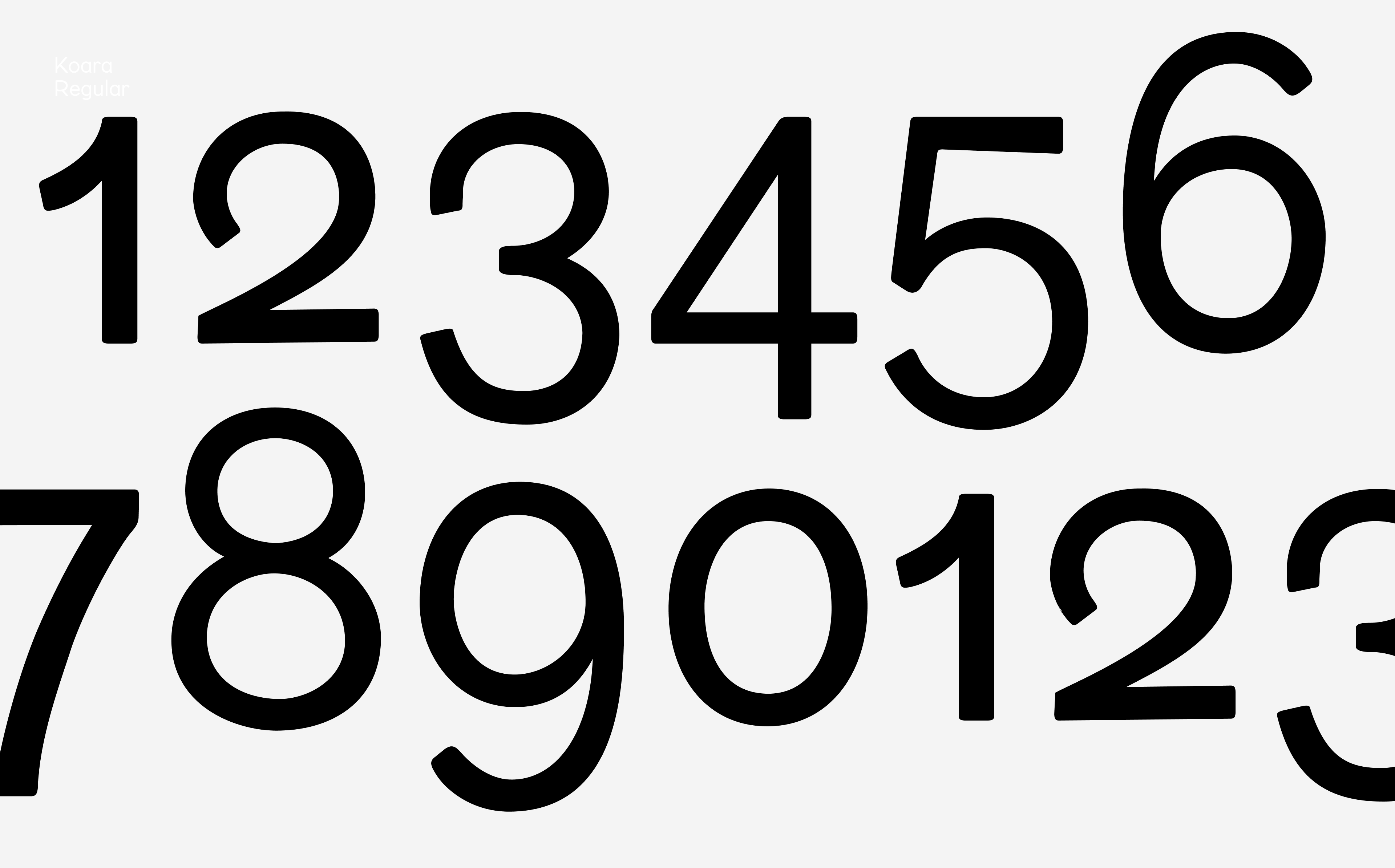
To address this, I designed Koara with a larger x-height and short descenders, imparting a cute and chubby aesthetic to the entire alphabet. The rounded corners of each letter add a layer of smoothness, mirroring the soft-edged nature often associated with children. This typeface aims to enhance the visual appeal of text for young readers.
Conversations to start
I spent a year at home during the pandemic. While it could be a depressing time spending the whole day at home, I got to spend much time with my younger brother who planned to start his days in kindergarten. While I was taking typeface design classes, I felt passionate about designing a typeface for my brother to stimulate his interest in reading.
Objectives
Design a children friendly reading typeface, for mainly educational reading materials
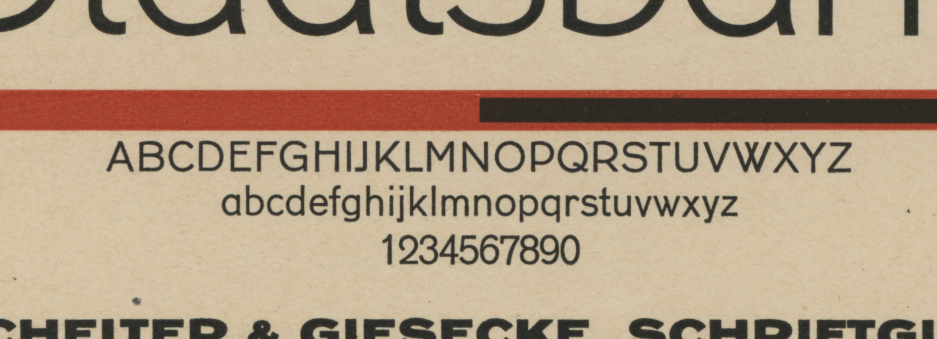
Reference: Koralle, Schelter & Giesecke, 1913. Scan coutesy of Tobias Frere-Jones
Research
Research were conducted to explore illustrative or Comic Sans typefaces along with current trendy kids' typefaces, highlighting their strengths and shortcomings. Typeface conventions were also studied, considering the challenges of ensuring readability in relatively small sizes while maintaining visual interest that resonates with the kids' style.
Before forming this idea of creating this typeface, I found the specimen named Koralle which made me come up with the idea of creating typeface for kids book text. Comic-sans is frequently used in kids' book, but compared to adults' magazines, the typefaces are often in handwriting style in kids' books. Creating a typeface that could be more formal than Comic-Sans but still giving the cute style is the direction I decided to go for.
Process
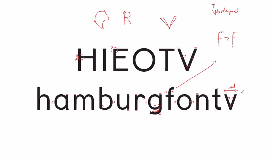
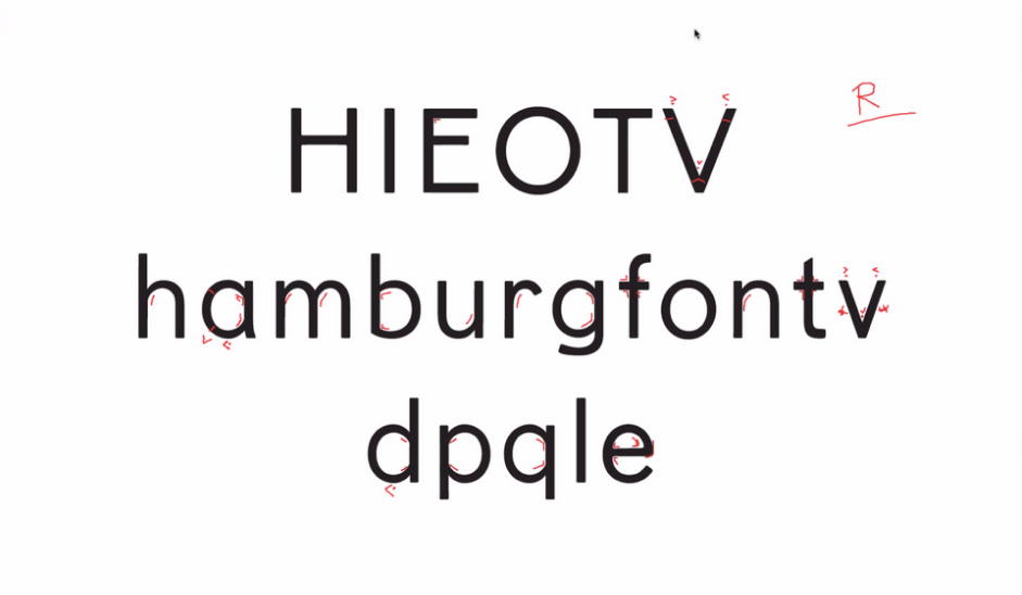
Individual Letters:
Pay close attention to the weight and relations between horizontal lines, vertical strokes, and the bowls. Apply identical structures to different letters to ensure visual consistency.
Words and Punctuation:
Ensure proper kerning and spacing for a harmonious flow. Maintain a consistent size for both lowercase and uppercase characters.
Process
Individual Letters:
Pay close attention to the weight and relations between horizontal lines, vertical strokes, and the bowls. Apply identical structures to different letters to ensure visual consistency.
Pay close attention to the weight and relations between horizontal lines, vertical strokes, and the bowls. Apply identical structures to different letters to ensure visual consistency.
Words and Punctuation:
Ensure proper kerning and spacing for a harmonious flow. Maintain a consistent size for both lowercase and uppercase characters.
Ensure proper kerning and spacing for a harmonious flow. Maintain a consistent size for both lowercase and uppercase characters.

Challenges
Ensuring readability at a relatively small size while maintaining visual interest that resonates with the style preferences of childrens
Product
Designed for versatility, Koara Typeface seamlessly integrates into both book titles and reading text. The name "Koara" is a fusion of "Koala," capturing the adorable essence of the animal, and "Koralle," a historical reference typeface. This deliberate combination ensures that Koara not only aligns with the charming style associated with koalas but also carries a touch of sophistication inspired by Koralle.
The result is a typeface that strikes a balance between playfulness and professionalism, making it ideal for a diverse range of literary applications.

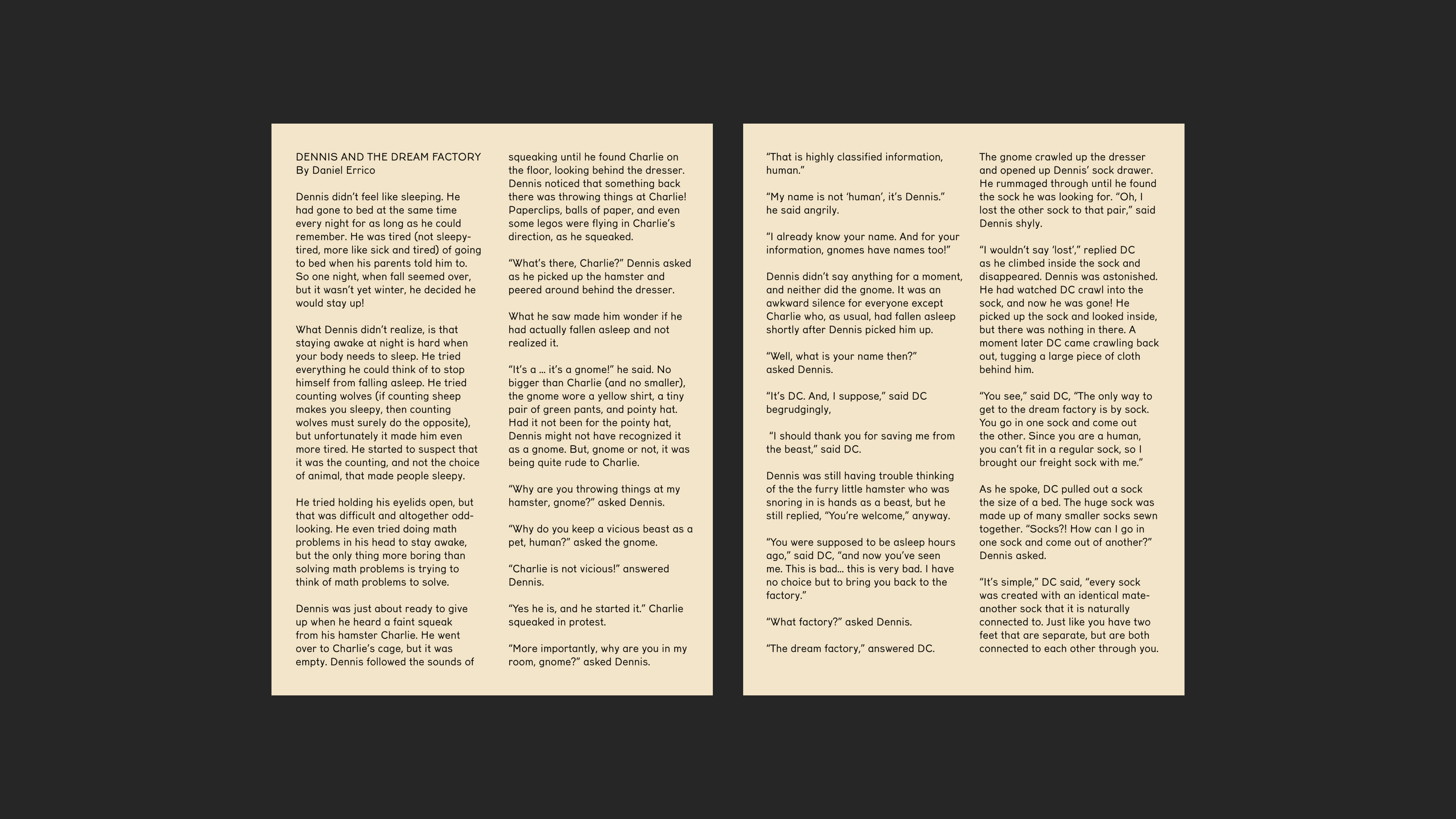
*The section of story content is from reechildrenstories.com.