A Product Designer with Visual Design background;
Previously worked at design agencies in New York: Area 17, Once-Future and Hudson Wilder
Selected work, 2D, 3D

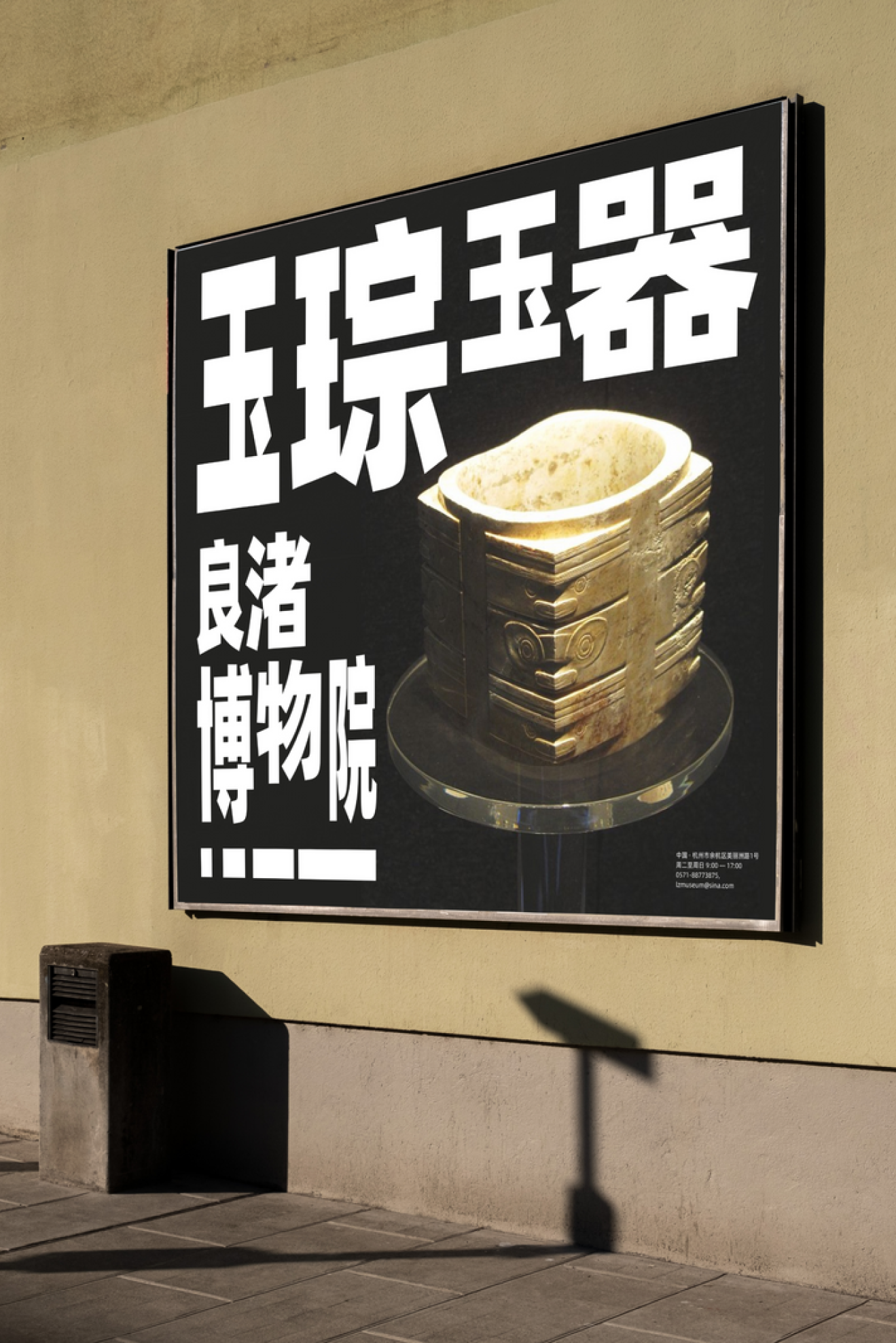
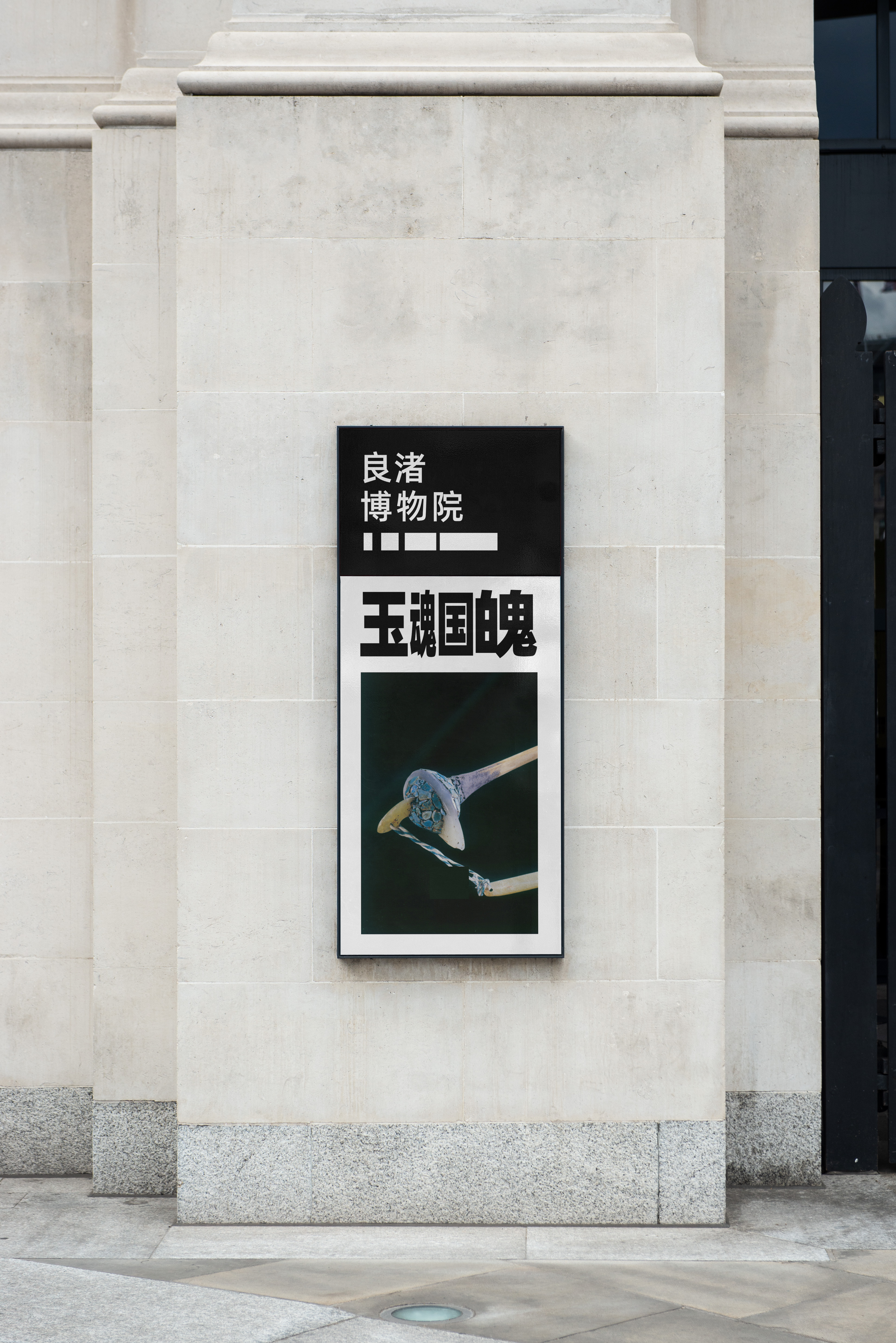
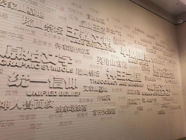
Liang Zhu Museum
2023
Brand identity
Keywords: history, architecture, culture
The brand identity project is for LiangZhu Museum, showcasing historical art crafts rooted in LiangZhu culture, and drawing inspiration from the museum's contemporary architecture set against the backdrop of rivers and villages.
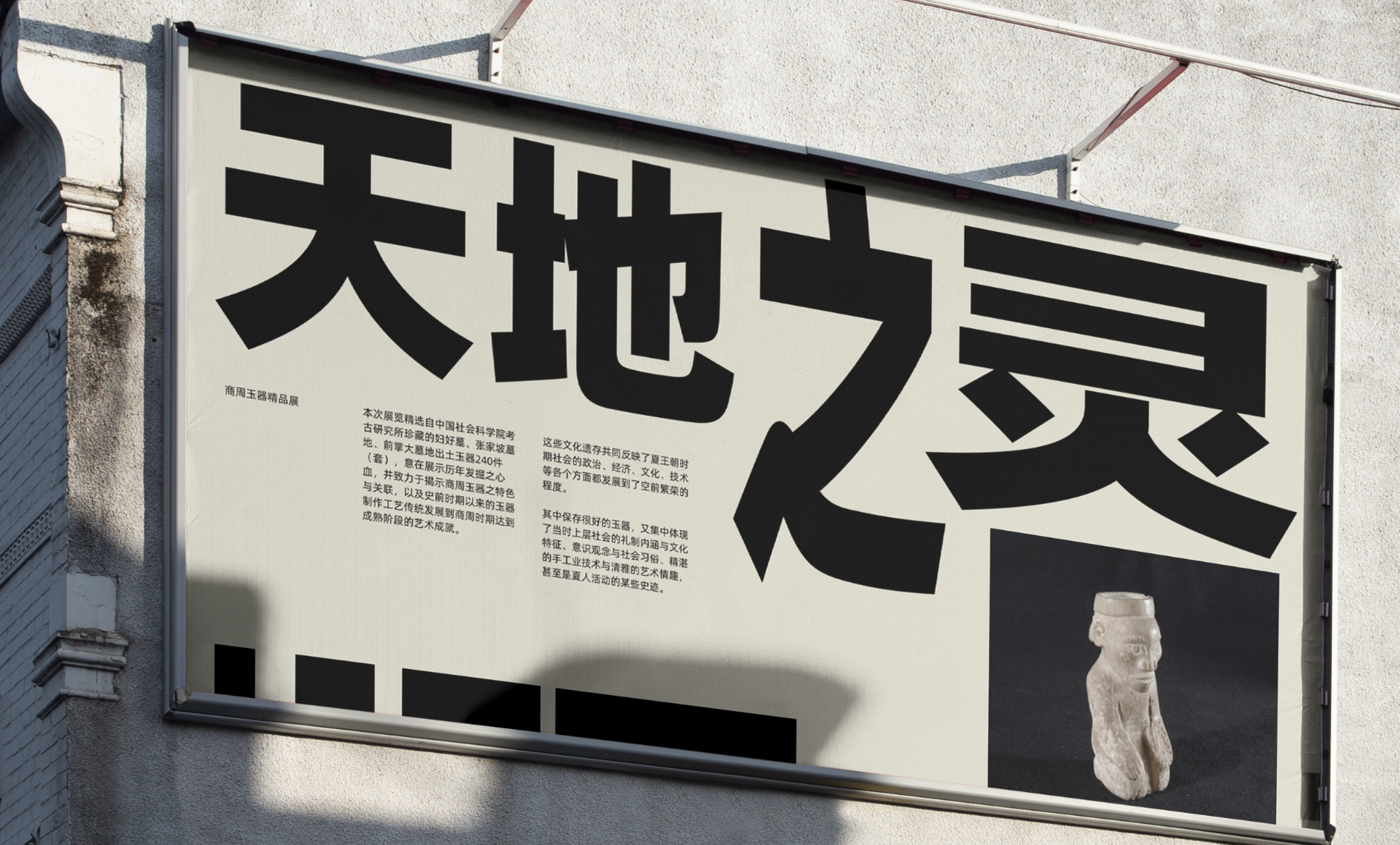
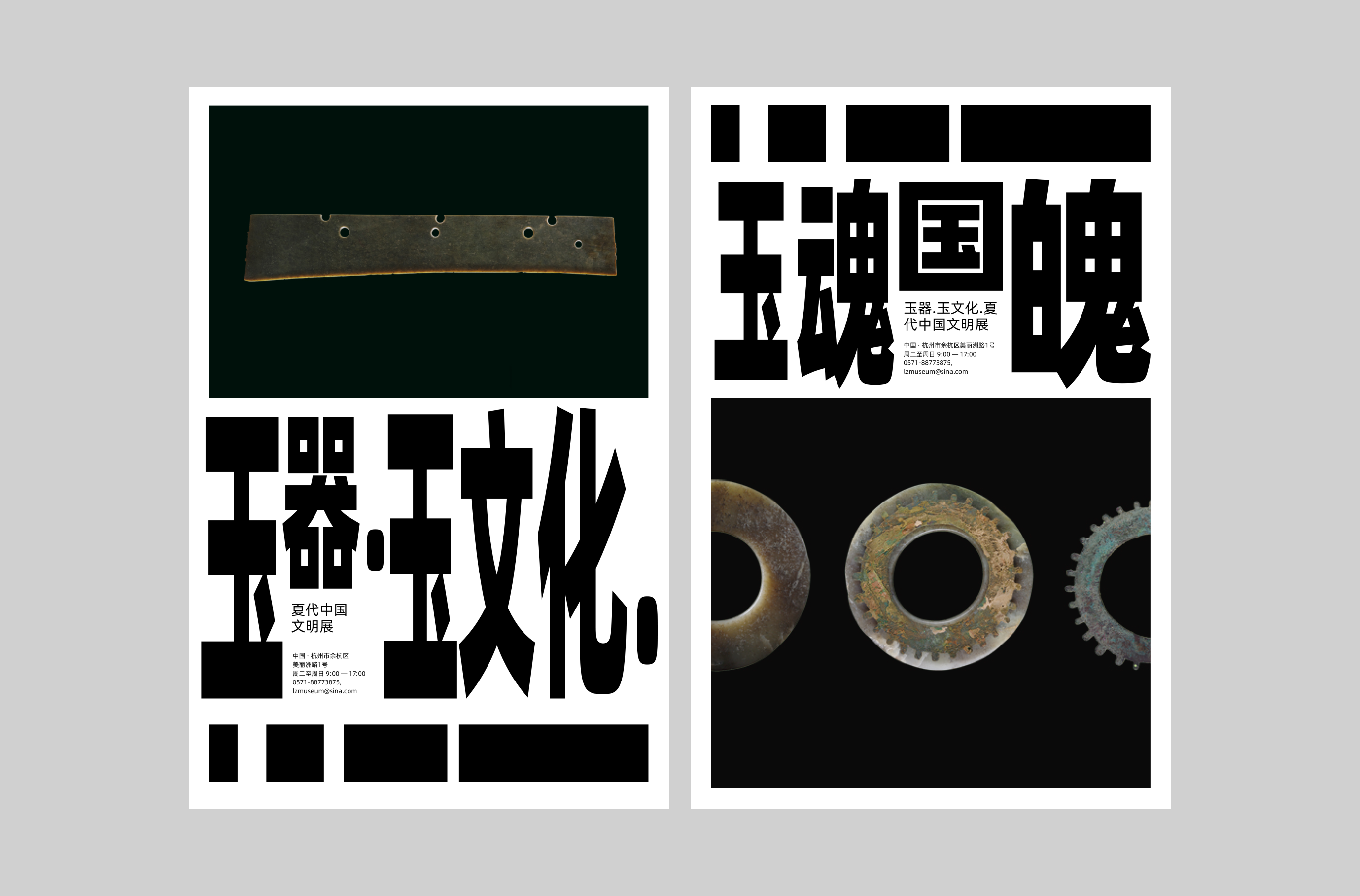
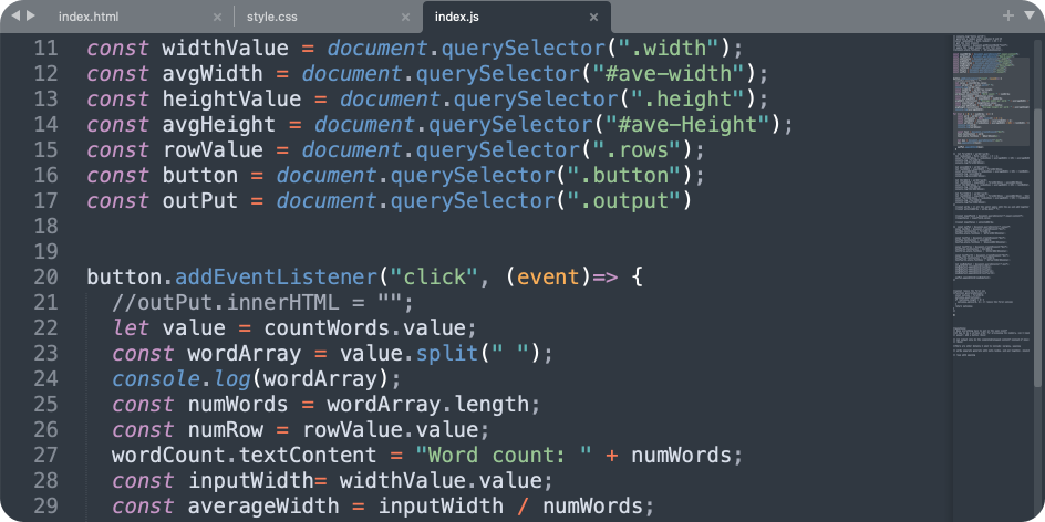
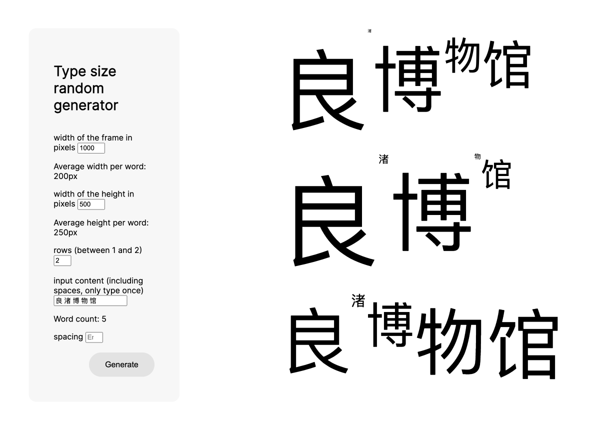
The foundational concept centers around "Mutability," symbolizing the perpetual flow of water and historical continuity. This idea is brought to life through coding a system tool for auto-generated scales of Chinese characters, mirroring the rhythmic movement of rivers.
Conversations to start
I spent my whole college life studying swiss design style within the context of western culture. Since my background is closely related to Chinese culture, I asked myself if there could be a way for me to combine my knowledge from both into one design project, which became the initial thoughts developing this project.
I told myself to look for a brand identity within Chinese culture that I feel passionate for, and it would also be interesting to apply my personal interpretation into it. While researching, the LiangZhu museum caught my eye.
*LiangZhu museum website
Objectives
Emphasize on the concept of “mutability”, applying the visual system on the idea of an ever-changing canvas, suitable for both print and digital format. Build a simplified design structure for supporting a consistent and flexible brand identity.
Process
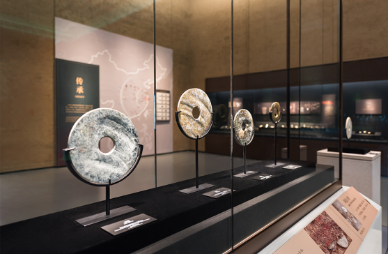
Liang Zhu Museum houses an extensive array of jade, stone, and lacquer artworks, all originating from the culturally rich Liang Zhu region.
The museum's contemporary architecture, crafted by David Chipperfield Architects, seamlessly integrates with the natural surroundings of rivers and local villages.
The concept of "mutability" draws inspiration from observing artwork displayed in physical spaces. Leveraging the distinctive characteristics of Chinese characters, each character occupying one square frame could be transformed into various scales and compose a new pattern. I planed to let the shape of each block be generated randomly, and making an interesting composition of all characters together.
Challenges
The structure of the Chinese language differs significantly from the Latin language, requiring adjustments when applying Swiss design principles. Unlike the automatic flow created from sentences of the Latin alphabet, Chinese characters consistently occupy square shapes.
Challenges
The structure of the Chinese language differs significantly from the Latin language, requiring adjustments when applying Swiss design principles. Unlike the automatic flow created from sentences of the Latin alphabet, Chinese characters consistently occupy square shapes.


Logo concepts
The logo is inspired from the shape of the architectures, four elongated rectangular structure, symbolizing bridges to connect Liang Zhu culture with modern society connecting this area with the surroundings. The logo is a simplified form of the architectures. It expresses the meaning of connections and continuity.
Code experiments
I took the next step to construct the functionality of this system. Instead of setting up typical brand guidelines to standardize each layout breakpoint, I designed and coded this auto-generated type size program as a template to let users control it. I separated input variables into content texts, height and width of expected frames. Once users imput numbers for how large the canvas will be and add the planned content, the program will auto-generate the typeset compositions.
Users can simply make further adjustments based on the results or implement it directly.
Product
Without decorative patterns to showcase the historical texture of the artifacts, this brand identity emphasizes on the idea of “mutability”, simple yet effective. Incorporating this earthy grey with impactful black and white, the identity aims to being approachable and nourishing.